Blog Post 32: Finalised FMP Portfolio and Product Link (FlipHTML)

Within Greg’s session (05/06/19), I looked back over the comments I had received from Greg regarding my FMP Portfolio. I also uploaded my magazine and portfolio into FlipHTML.

Below are the final changes that had to be made to my portfolio:

  • Mention the industry advice e.g. how invaluable it was to my development
  • Explain how reaching out to/interviewing the professionals was, in itself, effective journalism
  • Mention the fact that finding new/up-and-coming talent/bands was recommended, and how this provided brilliant content for the magazine

Below is the finalised version of my portfolio:

FMP Portfolio Year 2

Once I had made these final changes, I looked back over my magazine and uploaded it into FlipHTML. This allowed me to create the digital version of my product:

Rio Dennis: FMP 2019 Final Product (‘Zealous’ Magazine)


Blog Post 31: Finalised Product/FMP Portfolio

Within Greg’s sessions (23/05/19-24/05/19), I finalised my product (magazine), and completed the remaining chapters of my project portfolio:

As there are some difficulties with the FlipHTML site, I have had to include screenshots of my final project below (the link to my final magazine on FlipHTML will be added into my portfolio after the half-term break):

This slideshow requires JavaScript.

Below, is my completed project portfolio. It has been proof-read and edited accordingly, so it is ready for internal assessment:

Finalised FMP Portfolio

Blog Post 31: Second to Last Magazine Developments (Adobe InDesign)

Within Greg’ session (22/05/19), I came to the second-to-last pieces of magazine creation and editing. This was in the form of edits to the page layout, and overall presentation of the product

Below, are screenshots of the up-to-date product:

This slideshow requires JavaScript.

There have been a variety of changes made to the product. The main changes/edits that I made were:

  • I took the ‘main body’ font down in size, so it adhered to industry practice and industry examples. This gave the product a more refined, professional look.
  • From there, I included columns within the page layout, so the product had the layout of a magazine, and looked less like a brochure/book.
  • By changing the page layout, there was a lot of negative space left, so I took advantage of this by adding images alongside the content (with all the images within my product, they can either be used as ‘posters’ or general visual aids).
  • During this session of development, I was also able to add my second-to-last piece of content. As I had created a ‘Master page’ layout for my magazine, it didn’t take as much time to create the intended design for the page.

Overall, this session enabled me to begin wrapping up the creation process of my FMP. I was able to really see my vision coming together, and I was able to envisage how the final product would be presented in both physical and print forms. I have a clear direction going forward, with what I have left to do, and I am confident I will complete the final phase in time.

Blog Post 30: Continuation of Magazine Developments (Adobe InDesign)

Within Greg’s session (17/05/19), I continued with the creation and development of my magazine within Adobe InDesign.

Below are screenshots of the magazine’s development so far:

This slideshow requires JavaScript.

From the screenshots, you can see there has been a considerable amount added to the overall content of the magazine. Below are the main developments:

  • Ripped page texture (of the inner, front cover) has been deleted. I felt this design element of the magazine didn’t add anything interesting to the overall product. I also found that the quality of the effect wasn’t overly brilliant, so it would have looked worse within a physical copy of the magazine.
  • The majority of my content has been added to the magazine. This includes: two features and three reviews. For each these pieces of content, I have kept the ‘bordering’ lines on all of the pages, as well as the ‘torn paper’ effect. I kept these elements in order to provide the product with design consistency.
  • Alongside my content, I have started to place images into my magazine. These images can be used as posters, or can just be kept as visual elements within the product. Images will be added throughout the product once I’ve added more content.

Overall, this session has enabled me to really begin the experimental editing phase of my work, as well as really get a sense of how the magazine will present itself to my target audience. I have also been able to really create the ‘bulk’ of my magazine by adding my actual content. I have stuck with the idea of themed pages, and implementing key, focal points throughout the product.

Blog Post 30: Magazine Design Development (Adobe InDesign) and Title Shortlist

Within Greg’s session (16/05/19), I continued to develop my magazine within InDesign. I also looked back over my list of potential product titles in order to create a shortlist.

Below are the development screenshots:

FMP D Production 5FMP D Production 6Fmp D Production 7FMP D Production 8

From the development screenshots, you can see that I have started experimenting with textures and a range of colours. I felt that the use of the ‘paint splatters’ and ‘torn paper’ provided the front cover with ‘focal’ points that would stand-out, and draw my target audience in. The ‘paint splatters’ also provide spaces for smaller sections of  content e.g. what is included within the magazine/artists that are featured within the issue. The title ‘Loose Connection’ was just used as visual representation of a title on the front page, and may change within the duration of the development.

After developing the magazine design further, I decided to look back over the possibilities for my magazine title, and create a shortlist of the top five titles I felt were the most effective.

Below is the title shortlist:

  • Loose Connection
  • Zealous
  • Zest
  • Rise and Fall
  • Under Cover

Overall, this session has allowed me to really put into practice the more experimental elements of my design work, and begin bringing in elements that will appeal to my target audience. I was also able to start thinking about how I am going to present each piece of content within the magazine e.g. colour schemes, fonts, layout design etc.

Blog Post 30: Further Design Developments (Adobe InDesign)

Within Greg’s session (15/05/19), I continued to develop my magazine design. I also started to consider the possible titles for my product.

Below are some screenshots of the magazine’s developments:

FMP D Production 2FMP D Production 4

From the first image, you can see that I edited the inner cover to fit the ‘gradient’ theme of the front cover. This inner cover may become a contents page or that may follow the ‘Welcome’ page. For the ‘Welcome’ page, I decided to go for a plain background with accents of colour from the front page. I felt the plain background gave the magazine a bit of variety within the first few pages, and would ensure that any text could be easily read by my target audience. This page may also act as the ‘Contents’ page, but I will make a decision about this element whilst continuing to develop my magazine.

From this, I began considering possible titles for my magazine. For this, I looked at a list of existing publication names (Existing Publication Names) as well as a ‘music magazine name generator’. Below are the titles I have come up with so far:

  • Alt-Wave
  • Reverb
  • The Edge
  • Fuzz
  • Distortion
  • Alt-Attitude
  • Loose Connection
  • Mad Melody
  • Excess Access
  • Encore
  • Crescendo
  • Blare
  • Neow
  • Nu Soundz
  • Underground Sound(s)
  • Era
  • Electric Era
  • Neon Wave
  • Voltage
  • Zealous
  • Zest
  • Wavelength
  • Soundwave
  • Rise and Fall
  • Unplugged (Ollie’s suggestion)
  • Under Cover

Overall, this session has allowed me to begin thinking about the possible use of elements such as textures, text sizing and layers/overlapping. It also allowed me to explore possible title choices. From the list I have created, I will be able to create a short-list, and explore how they would look on a front cover.

Blog Post 29: Further Progression Discussion and Initial Digital Production (Continued)

Within Greg’s session (10/05/19), I continued to work on the initial design of my magazine. I also took part in a discussion with Chloe, Ollie and Amber regarding the progression of our FMP (how are ideas/concepts adapted since the start of the project). I also continued to update my portfolio alongside this work.

Below are screenshots of the development of my design so far:

FMP D Production 2

This screenshot shows the development of my front cover. I felt that the initial front cover I had created, would be better suited to the ‘cover’ page for a particular piece of content I had created. I decided to play around more with the ‘neon’ concept, and the use of colour in general. I also discovered the ‘gradient feather’ tool within Adobe InDesign. I found this seemed to add a retro aspect to my front cover (especially paired with the colours I had decided to use). For now, I have decided to keep the black and dashed colour for the inner pages, but these will be adapted once I add content into my magazine.

FMP D Production 3

This screenshot shows how I decided to move my initial front cover into my actual magazine. As mentioned earlier, I felt it would be much better suited as a ‘cover’ page for content, as it carries its own style and unique presentation. For the section of content that follows this ‘cover’, I will probably stick to the black and dashed colour to separate it from the rest of the magazine, but it will contain the key, feature colours of the magazine.

Below is the link to the discussion that took place:

(*the link will be added once I have access to it*)

Alongside this development of work, I continued to update my project portfolio (which is linked below):

FMP Portfolio Year 2

Once I have developed more of my digital design work and executed it, there will be visual evidence of my work added into my portfolio as well as upcoming blog posts.

Overall, this session has allowed me to really look into my industry research as well as my intended vision for my work, and really consider how the use of colours and inspiration I draw from the industry examples, will shape my magazine into a product that will adhere to my personal brief/vision.

Blog Post 29: Initial Digital Production

Within Greg’s session (09/05/19), I began the initial digital production process within Adobe InDesign.

I began by looking back over the images I had collected from the internet, and focused on the elements that were similar or the same to what I wanted to replicate within my own product. Once I had looked back over them, I recorded the process within the project portfolio.

From this, I started creating the ‘skeleton’ of my magazine. I focused on the basic layout of the cover page and a potential colour scheme I may decide to use throughout the magazine.

FMP D Production

I aimed to implement the ‘neon’ effect, I had seen on some of the examples, into my front cover. By using the solid black background, I was able to emphasise the colours that I had used within the lines, as well as the colours within the photograph. I aim to develop the cover page further by adding more images and text with visual (presentation) effects e.g. the use of shape templates etc. I feel that the black, pink and green will remain key, feature colours throughout the magazine. I feel that these colours are often overlooked and will give my work the unique edge that I’m looking for.

Below is my updated portfolio thus far:

FMP Portfolio Year 2

Overall, this session allowed me to use my industry research to influence my creative choices, and begin fulfilling the intended aesthetic and presentation of my product. It also allowed me to progress further with my general portfolio.

Blog Post 29: Initial Product Design

Within Greg’s session (08/05/19), I began the design work for my final product (magazine). For this, I researched images of various magazine covers and layout designs.

Below are the images I collected:

This slideshow requires JavaScript.

I managed to collect 26 images from various publications. I decided to include images from both music publications and other ‘specialist’ publications. I felt this gave me more variety in layouts, designs and the difference in aesthetics. Below are some of the key images I collected, and why I found them intriguing in particular:

1

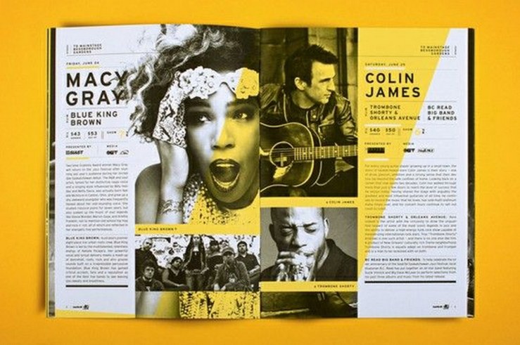
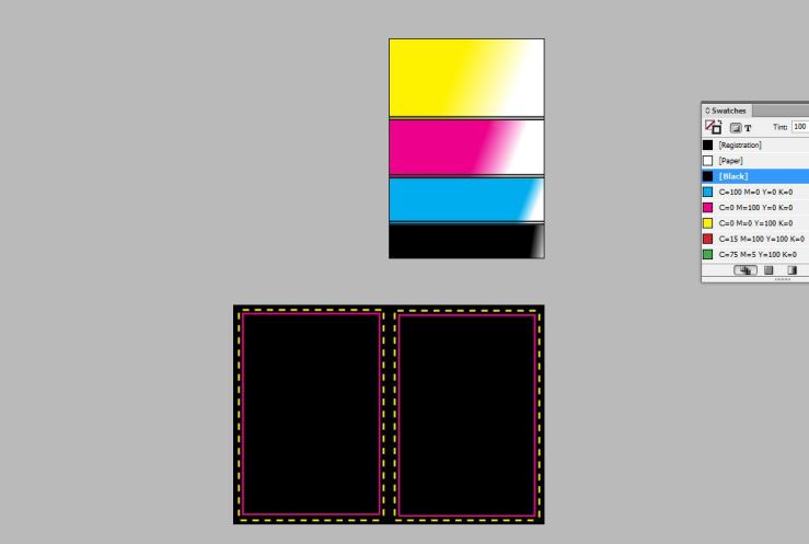
This was the first image that caught my eye, as I liked the contrast of black, white and grey against the bold, yellow ‘brushstroke’. I  felt this element of the page helped ‘highlight’ and draw attention to certain elements of the images that wouldn’t have necessarily been brought forward with the plain mono setting. The pop of colour also gives the page more dimension and contrast. The yellow also seems to be an ongoing part of the publication’s or the page’s colour scheme, so this ensures the piece is consistent in terms of the design/layout.

3

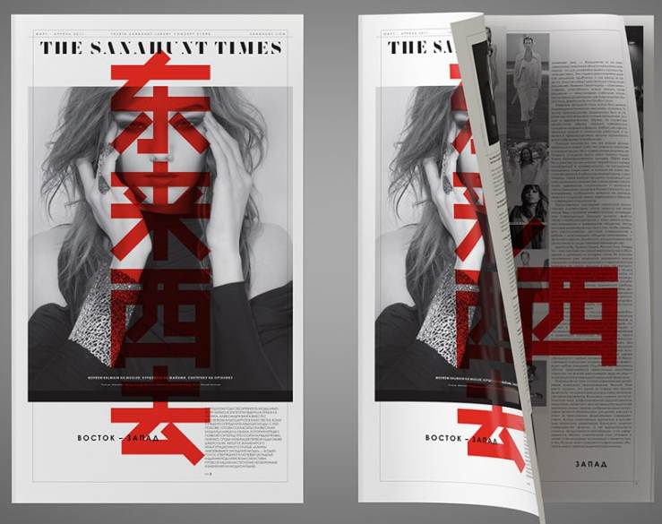
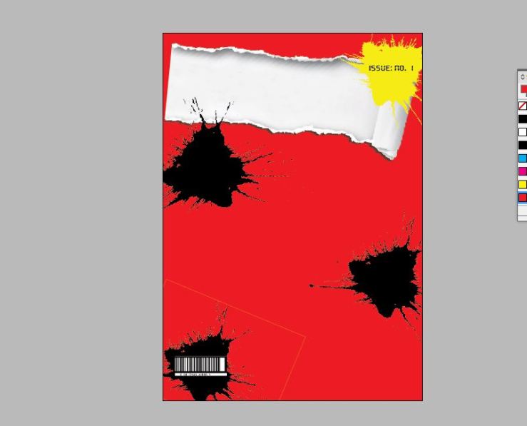
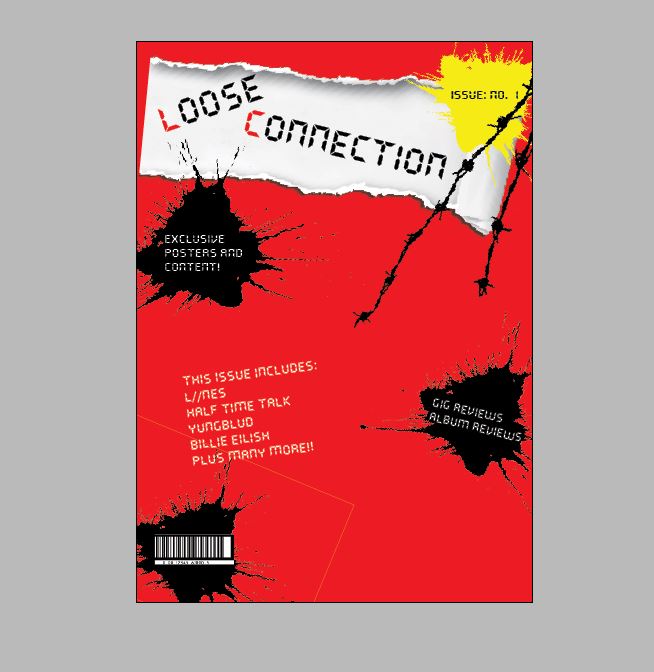
The same point applies to this images as well. The contrast of block colour against a mono background is what makes it so intriguing. By using the colour red, the publication is able to pull anyone’s attention in immediately. I feel this is more than likely due to the thoughts and emotions that red (usually) suggests. For example, red is usually associated with things such as passion, love, violence, energy, danger, strength and power. These are abstract ‘concepts’/’emotions’ that are impossible to resist/ignore. The ‘blood’ red that has been used on this magazine cover suggests that the contents of the publication is of great importance and shouldn’t be ignored.

17

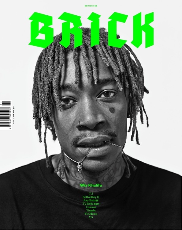
The simplicity of this design is what intrigued me the most. The use of the neon, bold font against the white background and black and white image gave the cover a modern edge, and reflected its intended audience/readership. The element I liked the most, was the font choice, as it was bold and modern, but it was still clear and didn’t take away from the key element of the cover (the image). The placement of the image ensures that it fills the first quarter of the page, and slowly covers less, so the ratio of negative space is well-balanced. This also ensures the cover isn’t over-crowded or overly ‘exposed’. The placement of the image within the middle of the page, gives the illusion that it forms a triangular shape that shifts focus to the title of the publication. This is an effective design element that is probably the most simplistic.

14

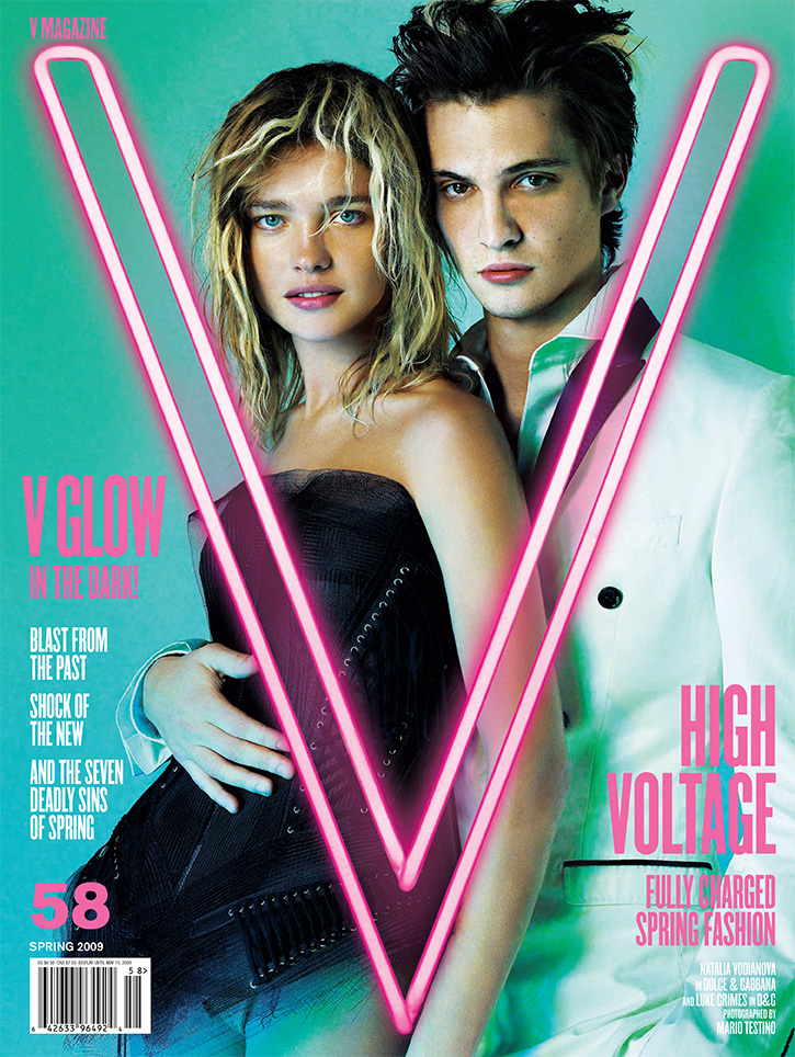
The element that drew my eye to this cover in particular, was the ‘neon’ theme and layout. The use of the neon pink ‘V’ within the centre of the cover framed the image of the subjects really effectively. The rule of thirds was definitely present within this cover, and the line of the ‘V’ followed the line of the model’s arm perfectly. The bold, yet simplistic colour scheme of pink, turquoise and white ensured the page didn’t seem over-crowded, and didn’t take away from the effect of the neon theme. Another effective element of the cover was the choice of models’ clothes. The plain, black and white simplicity of the clothing really emphasised the intensity of the colours within the cover. The contrast was the most effective element of the cover, and definitely succeeded in catching my eye.

Overall, this session allowed me to begin thinking more in-depth about the design element of my product, and how I would want it to be presented to my intended audience both in digital and printed forms. It allowed me to really consider the effects, spacing, colours and shapes (among other elements) that I could use within my own magazine.

Blog Post 28: Final Content Edits and Portfolio Updates

Within Greg’s session (03/05/19), I continued with the editing process of my project. I was able to create final versions of my work. This then allowed me to progress with the production section of my portfolio.

Below are the links to my final pieces of work:

Upfront and in Yer’ Face Final Edit

Music and Politics Final Edit

Billie Eilish- Bury a Friend Review Final Edit

The Curse of 27 Final Edit

LIINES Gig Review 19-04-19 Final Edit

Half Time Talk Gig Review 26-04-19 Final Edit

Overall, this session has ensured that I was able to take feedback on-board, and fulfill the role of editor independently. It also ensured that I was able to create a link to my final edits, in order to progress with the production aspect of my portfolio.